Personally, I feel that the UI interaction design is illogical.
I feel that the UI for ATC27 isn’t very effective. Everything has to be enclosed in a box, and a bit of transparency is added as if to prevent anything from being blocked—but for the most part, it just serves as a visual distraction.Setting aside aesthetic concerns for a moment, let’s look purely at functionality: taking ATC4’s Aero style as an example, Air Traffic Control 27 features a transparent black background with high-contrast white borders, while ATC4 uses transparent borders with opaque key information. Furthermore, the window colors immediately allow you to distinguish between departing and arriving flights.I saw another UI design on your official website—it might have drawn some inspiration from ATC4’s layout—and personally, I think its aircraft card design is even better than the current demo version.
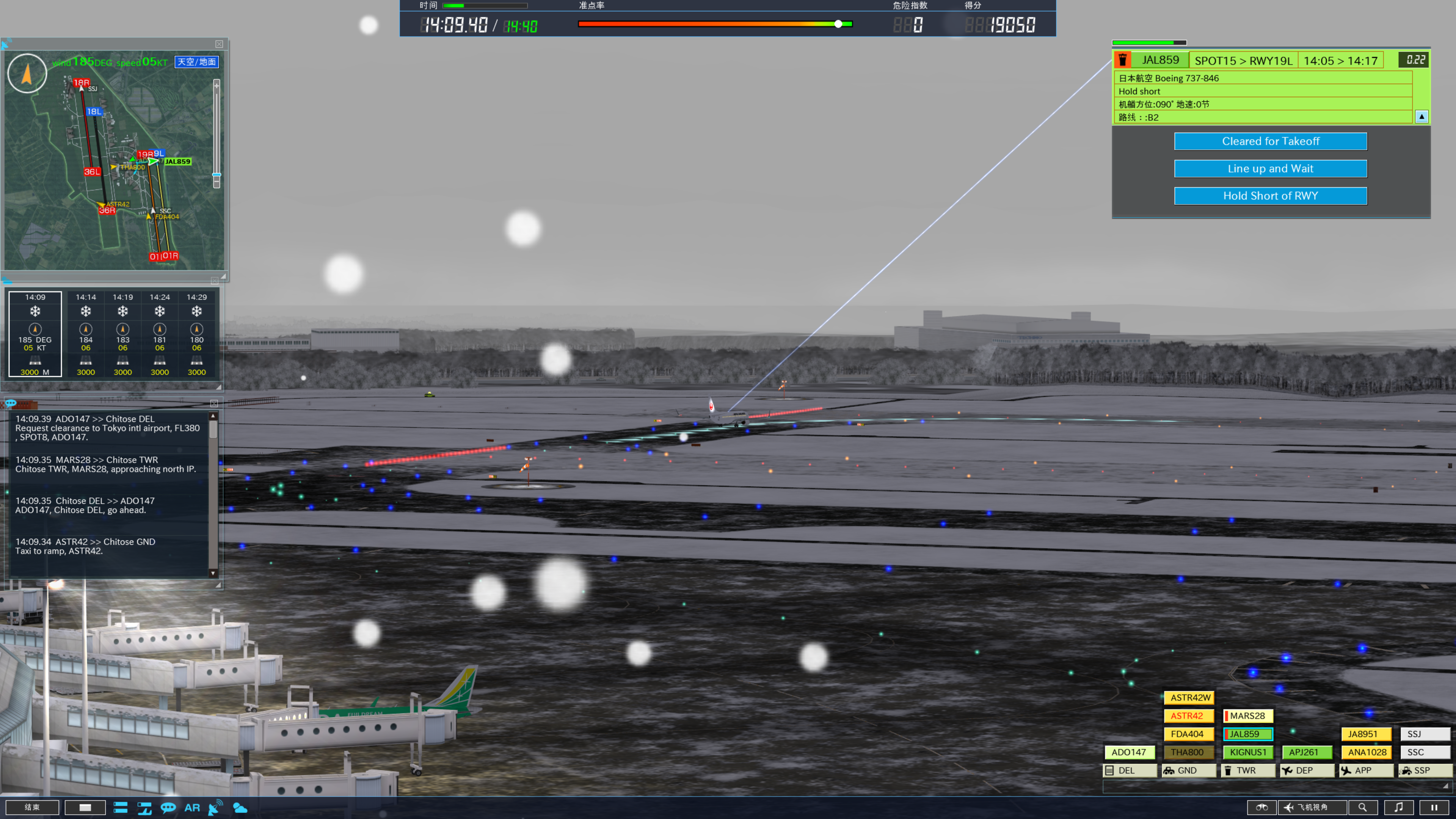
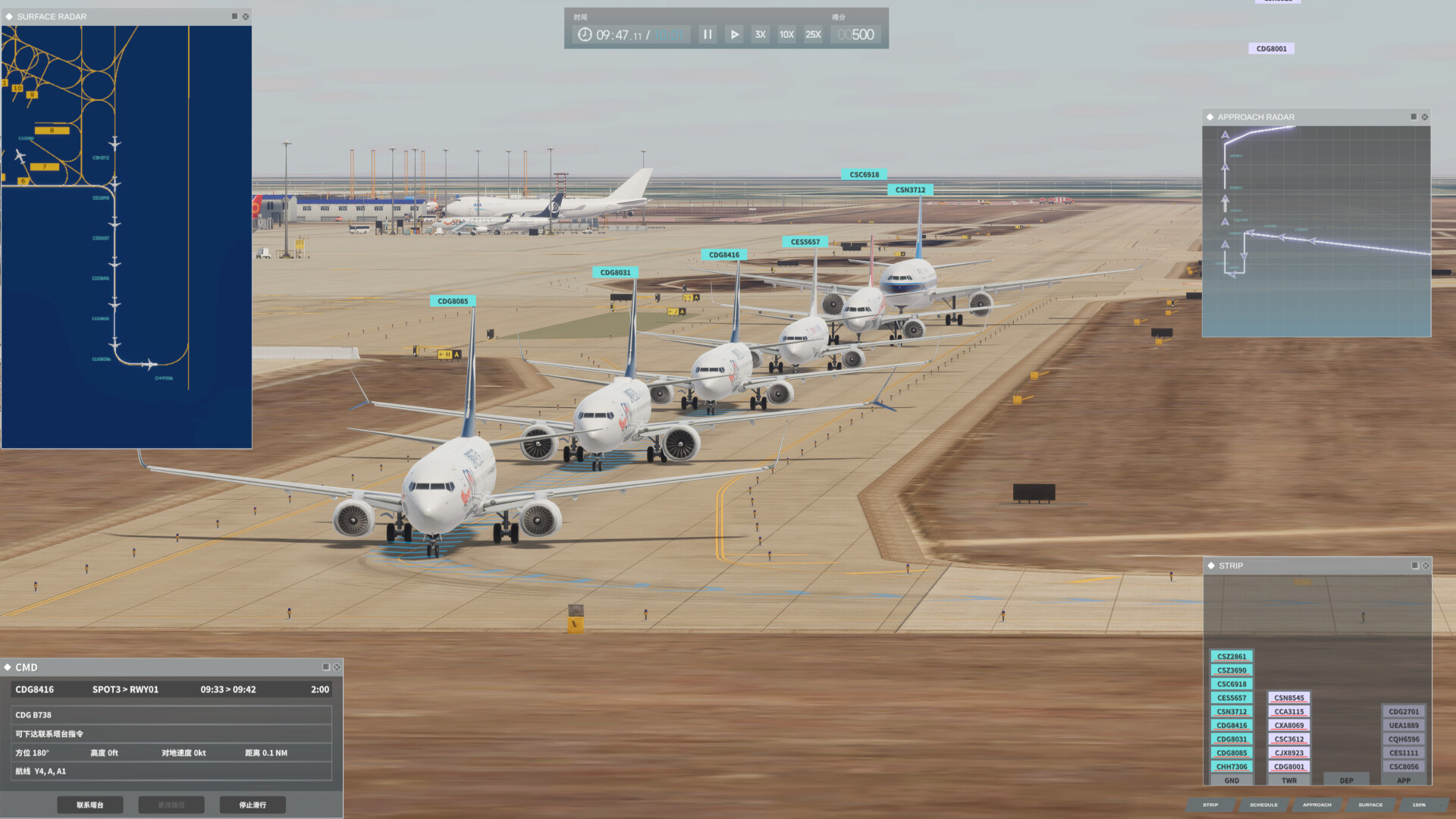
Secondly, unlike ATC4, the aircraft information cards and control buttons are separated, and the layout is stretched out very wide, forcing players to constantly scan back and forth between the information cards and the button options. Also, for some reason, the aircraft information cards make the less important details larger? Apart from the distance to the airport—which is relatively important—the estimated arrival time and the runway to be used are displayed in very small text; conversely, details like altitude, speed, and direction—which players generally don’t need to worry about much—are displayed in very large text, which I find baffling.In ATC4, the most critical information—the runway and estimated arrival time—is clearly enlarged and displayed in the top-right corner, while secondary details are arranged in smaller font below. The aircraft card and control options are also tightly integrated, so a quick glance at the top-right corner provides virtually all necessary information. The top-left corner similarly allows players to toggle between ground view and air radar using the spacebar, and wind direction is also displayed there, eliminating the need for players to constantly scan the screen from side to side.
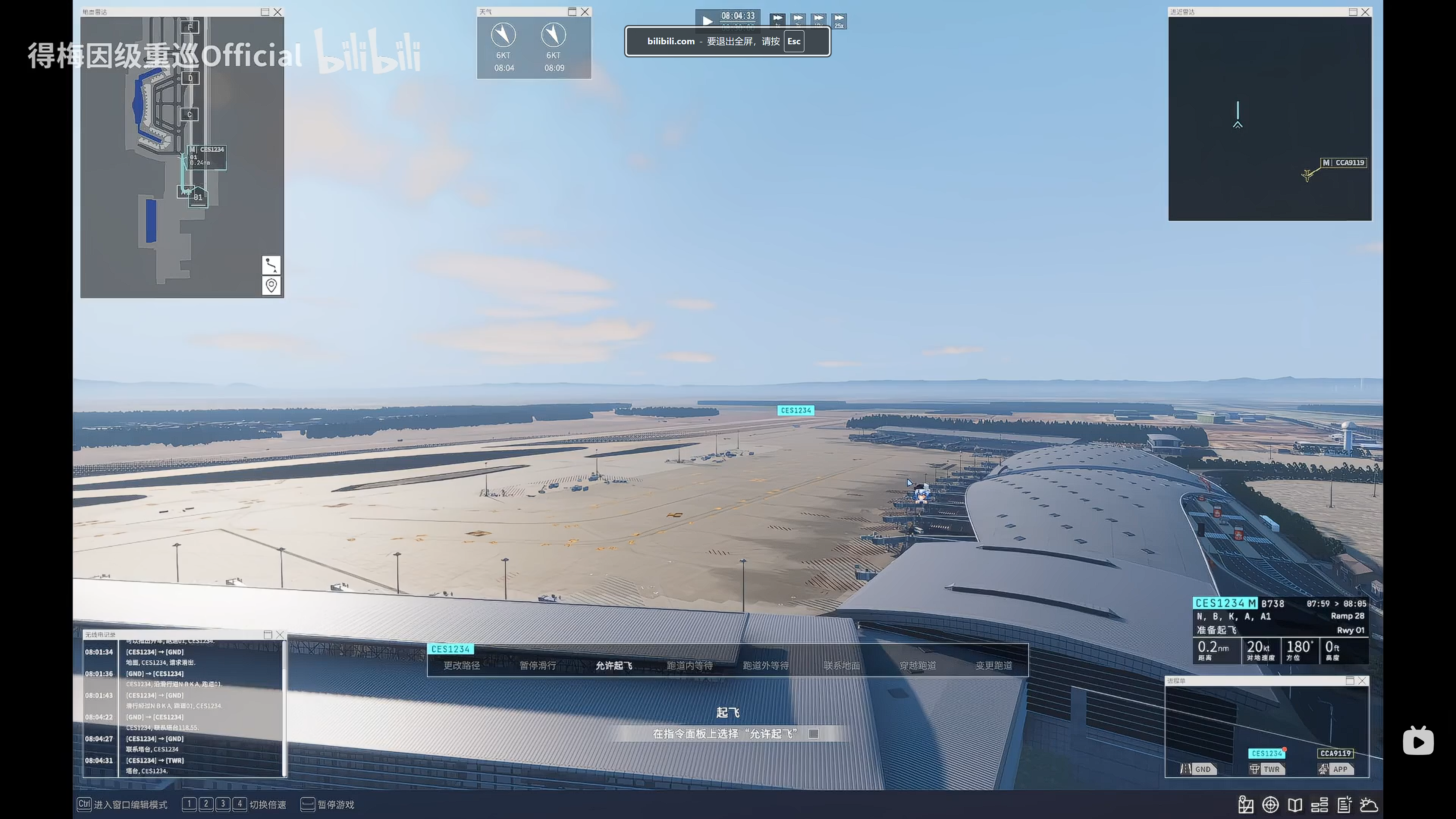
Image source:
[Airport Control 27] Is this UI design just a reflection of my own poor comprehension skills? I’m starting to question my own existence. https://www.bilibili.com/video/BV1n19PB2Er9/)
Additionally, there are two major issues with the aircraft control menu: not only is it poorly aligned with the aircraft, but it also displays many unnecessary or unusable options.For example, in the options shown in Image 2, the runway takeoff-related options are sandwiched between other options. However, since control has already been transferred from ground to tower at this point, ground operation options are still displayed— and the horizontal layout only exacerbates this issue. Similarly, during landing, the go-around and exit selection options are often displayed together. What if a player accidentally taps go-around while trying to select an exit? In ATC, the buttons only display the options you can select, so there’s no need to worry about accidental taps at all.
Another issue is that the airport overview map on the left automatically zooms in on the current aircraft’s location whenever you select a plane. I’m not sure if this behavior can be disabled, but this feature feels rather pointless—you have to manually zoom out every time after selecting an aircraft. I hope this can be adjusted in the settings. Additionally, the ATC radar lacks reference points and fails to provide sufficient information.
In summary, while I don’t think Air Traffic Control 27 has any major gameplay issues, it feels like the framework has only just been set up. Its gameplay (it lacks the intricate level design found in ATC4), art style (it’s too clean—almost blinding—and the airports lack vitality), optimization, UI interaction, and other aspects still need further refinement.
Log in to comment and vote
Comments2
ypsilon
Apr 3
感谢反馈。
“不需要的或者用不了的选项也会显示出来”的原因是,按钮的可用/不可用是随着飞机状态的改变而改变的,假设一个情况,目前一共显示4个按钮,你的鼠标放在【第二个】按钮上,此时飞机状态发生某个变化后,【第二个】按钮变得不可用,这时候如果直接移除这个按钮,你的鼠标可能会点下【第三个】按钮。我们想避免这类情况,所以目前就会像控制面板一样,同时显示所有按钮,无论可用还是不可用,按钮的位置是需要很稳定的,以防止误触。这是我们目前的解决方案,如果有更好方案欢迎提建议。
复飞和降落两个高风险按钮,都是有长按确认选项的, 默认不勾选,在设置里可以进行调整。
飞机从地面移交到塔台后,不仅有起飞和LUAW,可能由于特殊原因需要脱离跑道,所以仍然保留了允许滑行的按钮。
场面雷达可以在设置里关闭跟随选中的飞机。
UI里的所有可见窗口都可以随意拖动摆放和改变大小,如果玩家觉得需要频繁左右摆动,可以改变飞机信息面板的位置。
其他的反馈也都一并记录,再次感谢你的反馈,我们会持续改进游戏的UX表现。
RCPD64
Apr 3
此外附上游戏ATC:Greenlight的管制图供参考